MathsCounts logo winner!
Thanks all for ranking the 9 MathsCounts logos.
Results!
First choice (Score 2.9*)
Comments:
Clean and stands out.
Clear, bold, good strapline.
Colour ok, font clear and tidy, strapline better, ruler nice but somewhat stereotypical, overall reasonable.
Great positive message!
I ranked this #1, and I’m not sure why. It just drew my eye more than the others.
Important about it’s important to say so.
Like the strapline and the ruler/colours/size.
Love the strap line x 2.
Maths should be darker green and counts lighter green.
Really don’t like the tag line which is why I rated it last…
Strapline hits the core issue really well.
The strap line is great. I like the colours too, v vibrant.
Second choice (Score 4.1)
Comments:
Great message!
The lights font is cool but will age too fast.
Colour good, font childish, strapline not really catchy. Ruler inoffensive. Overall poor.
Capital letters for maths.
Maths needs larger font than counts.
Colours too washed out.
Like the positive strap line.
Like the strapline and the colours, make the word maths a bit bigger? Capitalise the M.
Somehow the top edge of the “maths” line isn’t strong enough.
Like strapline. Not sure about font.
Third choice (Score 4.3)

Comments:
The colours and font are nice.
Colour dull, font unclear and unprofessional. Thumbs up unprofessional. overall poor.
Sums up.
Maybe chalk instead of thumb up, overall the best.
Not a huge fan of the “+1”, but strong graphical image overall.
Like thumbs up but not black.
Fourth choice (Score 4.7)
Comments:
This one isn’t v memorable, maybe a stronger colour combo would help.
Colour ok, font clear, operations slightly childish, overall inoffensive.
Contrast between text and background would improve this.
Neat and simple.
Dull colours.
Like the h/t thing. Now so sure about the choices of symbols. Why only arithmetic?
Colour could be bolder. Needs strapline but clear.
Fifth choice (Score 5.5)
Comments:
Makes me think of a edu-profit company, not sure why.
Colour ok, font cluttered and unprofessional, Not a protractor… also stereotypical. Overall poor.
I don’t like the set square, text might be a bit too big?
Like the dynamic look of the triangle.
Bold design. Strapline would improve it.
Fifth choice (Score 5.5)
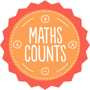
Comments:
Colour contrast doesn’t work 🙁
Colour ok, font unclear and unprofessional, operations slightly childish, overall inoffensive.
Font not dark enough needs to stand out more.
Writing needs to be more prominent.
The words don’t stand out enough?
Colour could be significantly better; why only arithmetic operations? Seems babyish.
Don’t like colour. Needs strapline.
Seventh choice (Score 5.6)
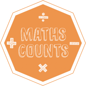
Comments:
Nice look, would like a bolder colour combo.
Colour ok, font clear but unprofessional, operations slightly childish, overall inoffensive.
Colour in centre too similar and white not easy to read.
Not modern enough.
Looks cool.
I wish the colours were not both so reddish.
Hate it all.
Eighth choice (Score 5.9)
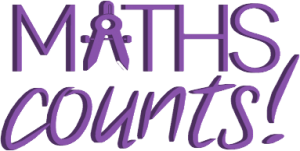
Comments:
This makes me think of mymaths (eek!)
OK colour, clear font, compass is kind of ‘cutesey’ – overall ok, but maybe childish.
Like this but not sure if it should have a background.
Neat and simple.
Looks tacky.
Put something behind it, maybe a bit plain?
Pretty strong; good colour.
Add strapline. Font lines a bit thin.
Love the colour and the compasses are clever.
Ninth choice (Score 6.5)

Comments:
The colour and look is jaunty and cold, but a little empty.
Good colours, clear font, clean design overall.
Boring x 2
Eh. If it were a button (which it looks like), I wouldn’t choose to pin it on my bag.
Not very marshy.
Simple and effective for me.
* Remember, a low score means a higher preference
Next job, build a website!