Sports Day Infographic

Background
The Head of PE (Nic Christo) asked me if we could do some cross-curricular work in maths lessons that linked to the upcoming sports day. To keep the buzz of sports day going, Nic wanted English, Maths and Science to do some sort of project. So year 8 scientists looked at the energy expended by athletes in different disciplines, while year 9 English lessons did some post-sports-day reporting.
For my year 7s I chose to take the data and turn it into an infographic. Increasingly, infographics are being used in magazines, newspapers and on websites to present a melée of information in an eye-catching way. They tend to use fewer bar charts and more proportion-based representations such as pie charts or the ubiquitous stickmangraph. At some point I think drawing and interpreting infographics are going to form part of a school curriculum.
The video to the right is a photo montage of the morning, which despite being beaten in the staff vs students 4x100m relay, was the best sports day I’ve ever been part of: so slickly organised that we finished early; students who were competitive and sportsmanlike; a nail-biting close to the year 7 competition (finally decided on a tug of war); and an oddball member of the public who insisted on running round the track while we were competing on it!
Maths Lessons
Before doing the data analysis and creative work on the infographics, I set a couple of homeworks just doing basic infographic comprehension. This meant that when we did actually begin, pupils had a good idea of the end product. Here are those homework files:
Infographics HW 1
Infographics HW 2
We then spent four lessons as follows:
Lesson 1 – what are infographics useful for? Types of INFOrmation in INFOgraphics? Types of GRAPHICS in infoGRAPHICS? What kind of information do we have about Sports Day? What Sports Day graphics would be good to include. Get into self-chosen groups of 1, 2 or 3 pupils. Begin looking at the data. I provided them with a Google Spreadsheet containing the results (I’ve removed the names). I also sent them a link to a Google Presentation containing some graphics I’d assembled that I thought might inspire their drawing (see slides on the right).
Lesson 1 Infographics Flipchart
Lesson 2 – draft a masterplan and begin drawing each element of the infographic on small separate pieces of paper.
Lesson 3 – finalise each element of the infographic and glue on to A3 paper.
Lesson 4 – laminate the finished article and write a reflection on the work.
Finished articles and Gallery
Their work culminated in an art gallery type event whereby dignitries (Head of Year and Head of PE) came to see the infographics that we had hung on the wall of the sports hall.
A pair of judges (Nic and another colleague) went round looking for accuracy in their statistics, for flair and for ‘joie de sport’.
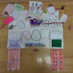
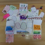
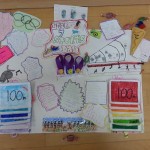
There was a clear winner – a group of 3 girls had created a 3D, interactive infographic. Take a look at the images below and the video on the right.


Reflection
The end products blew me away with their creativity and effort that’s for sure and the pupils created work they were genuinely proud of – many choosing to talk about it in their end of year portfolio presentations. I’d say they aced the graphical element of infographics but there’s room for improvement on the information side! I don’t tend to do much of this kind of work (postery, self-organising pupils) in lessons so I’ve learned something about where I need to be hands-on and where I need to be hands-off. More importantly, I now have a better idea of the data crunching side of things. While one student did come up with the idea of drawing a pie chart within a pie chart, which he called a ‘pie-ception chart’ (after the film Inception, based on dreams within dreams), next time I’ll better prepare students to turn the raw data into proportions and represent the information imaginatively – something the best infographic designers do well.
Resources
The spreadsheet I sent them:
Here is a huge list of websites to visit that might help your classes:
[listly id=”3G6″ layout=”full”]
Great Post – definitely going to come back to this when it comes to a year 7 stats unit!
A great first cross-curricular project at KSA involving the PE Dept. An awesome success for all staff and students involved. Thank you for your support in making this happen, Bruno.